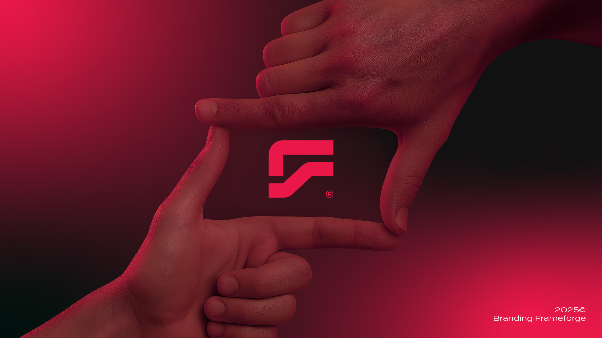
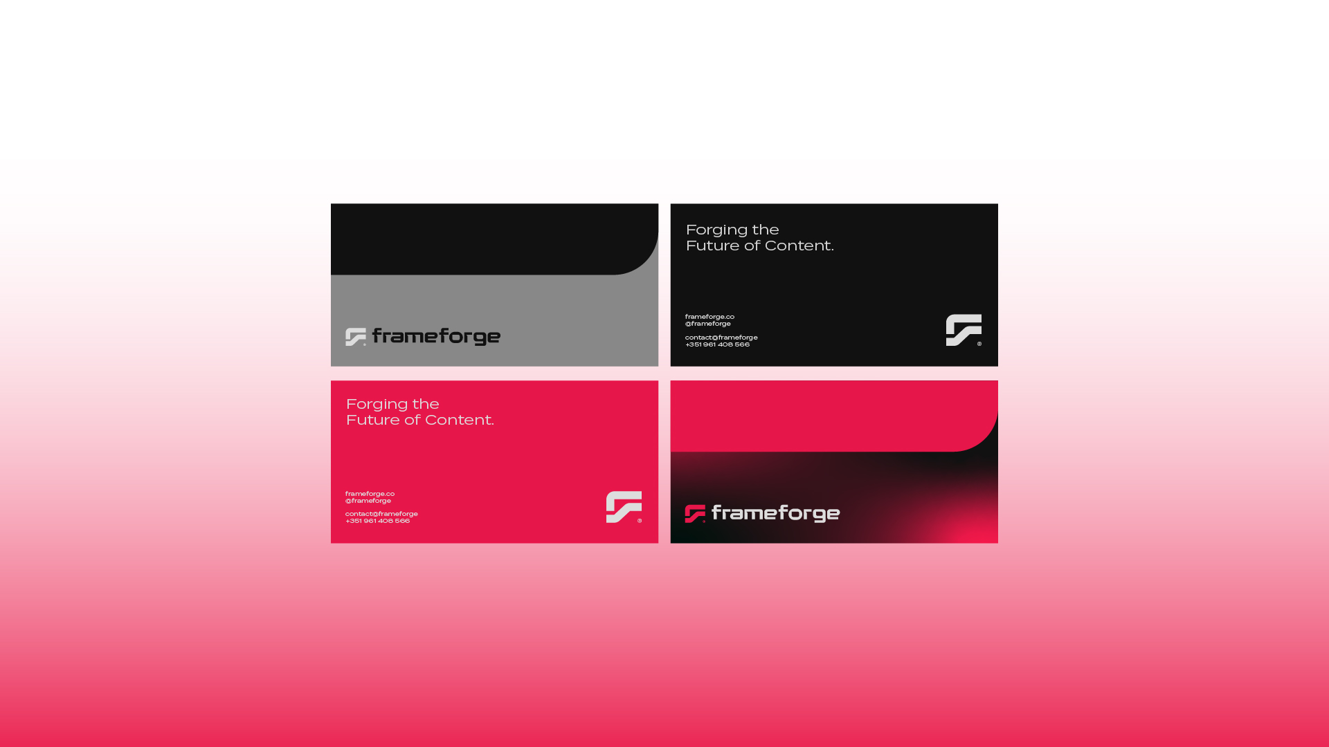
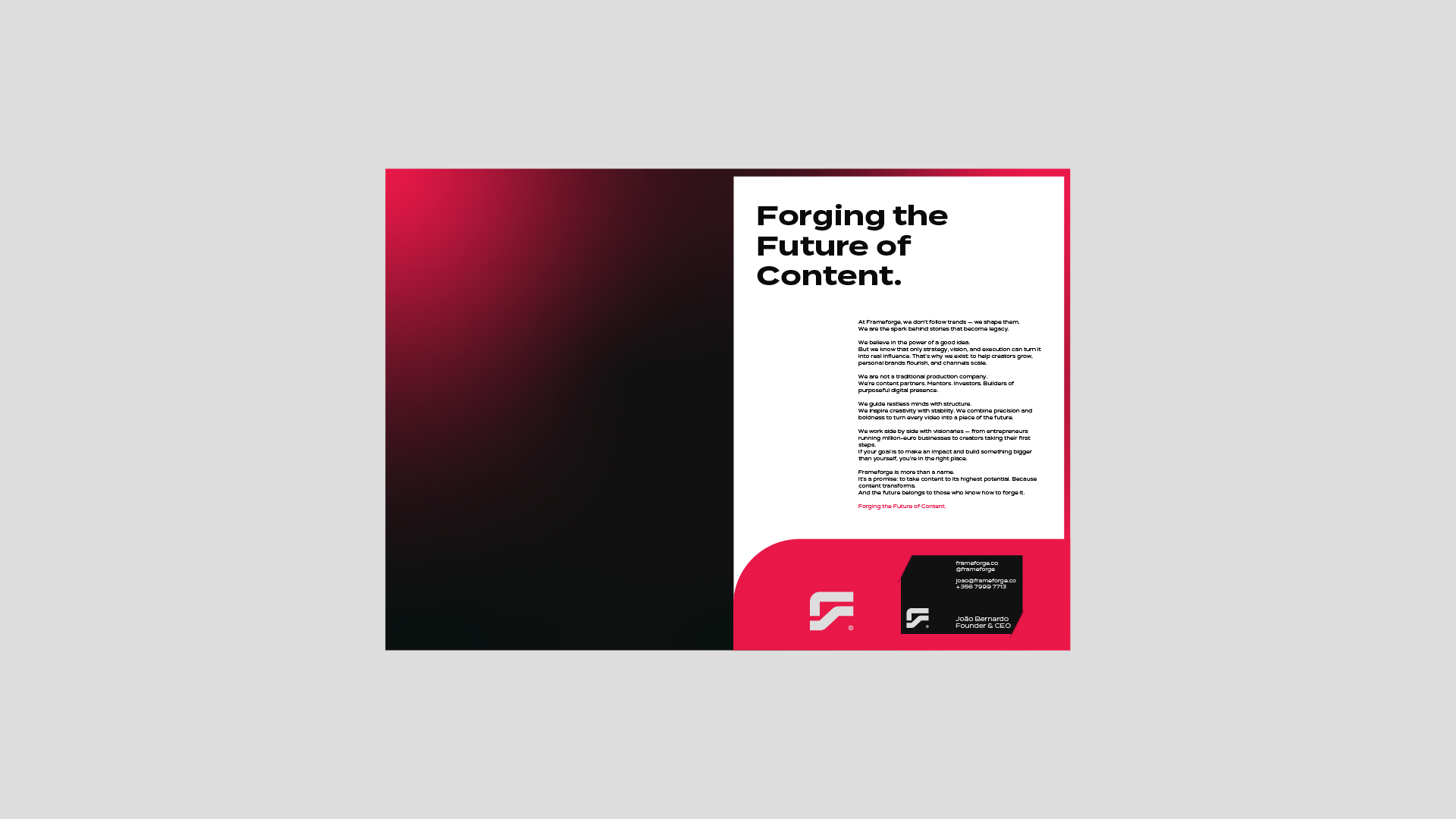
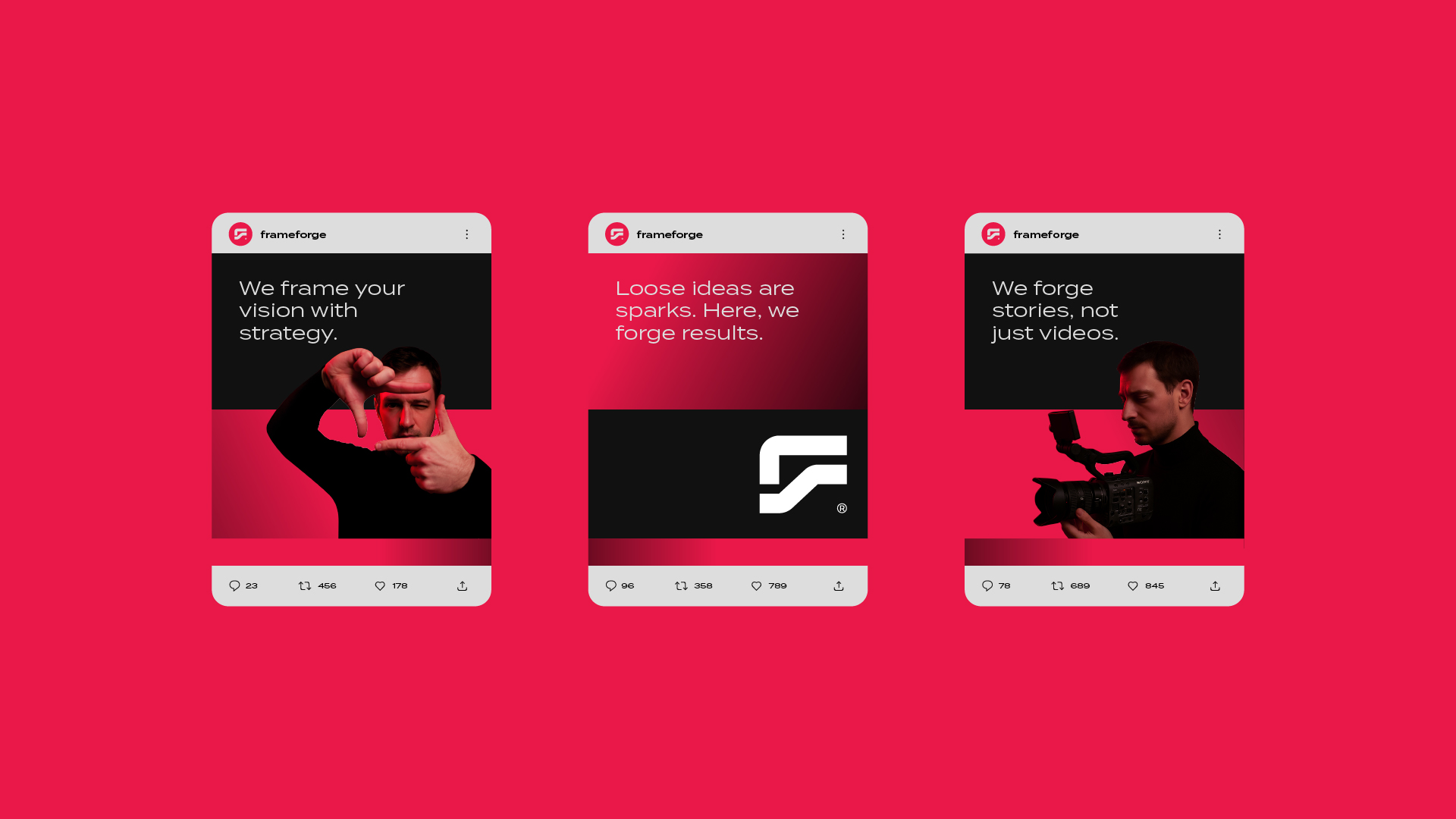
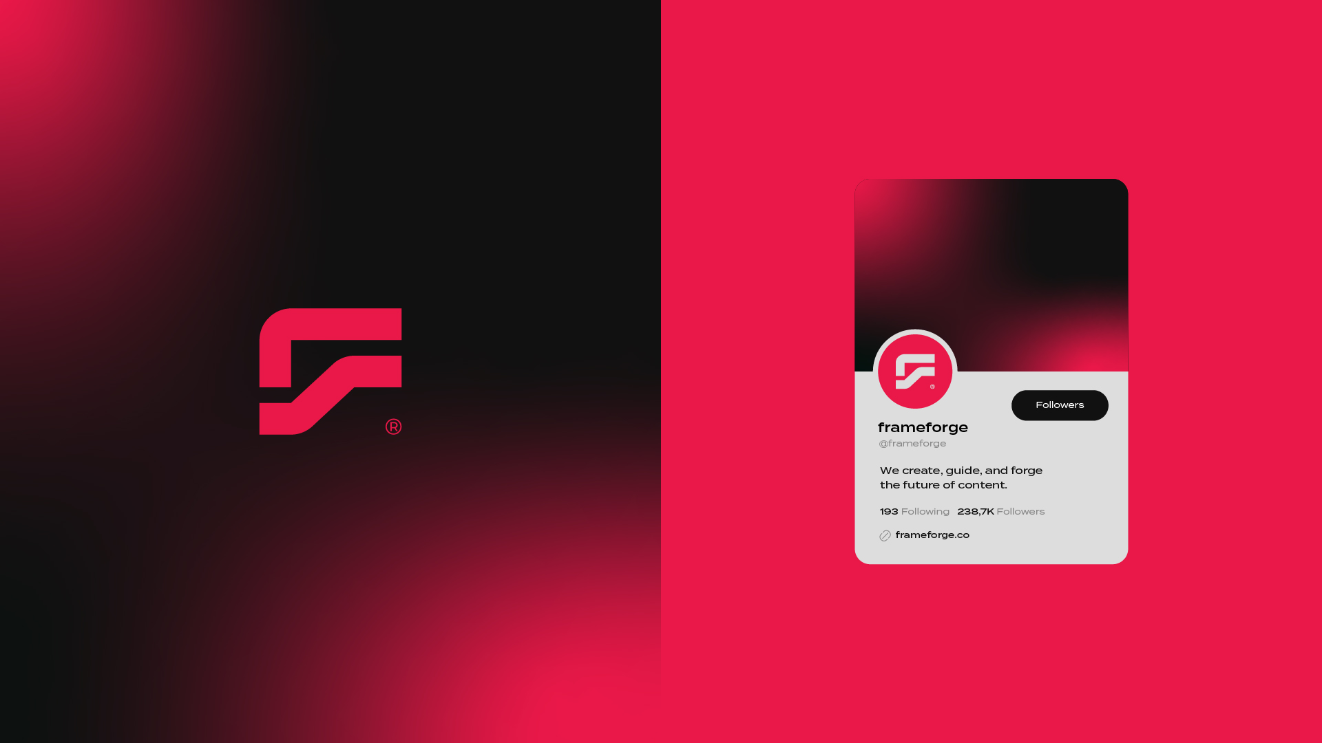
This rebranding project was developed for Frameforge, a brand in the audiovisual sector with the ambition to establish itself in the global market. The new identity was designed to convey sophistication, functionality, and symbolism, reflecting the company’s strategic positioning.
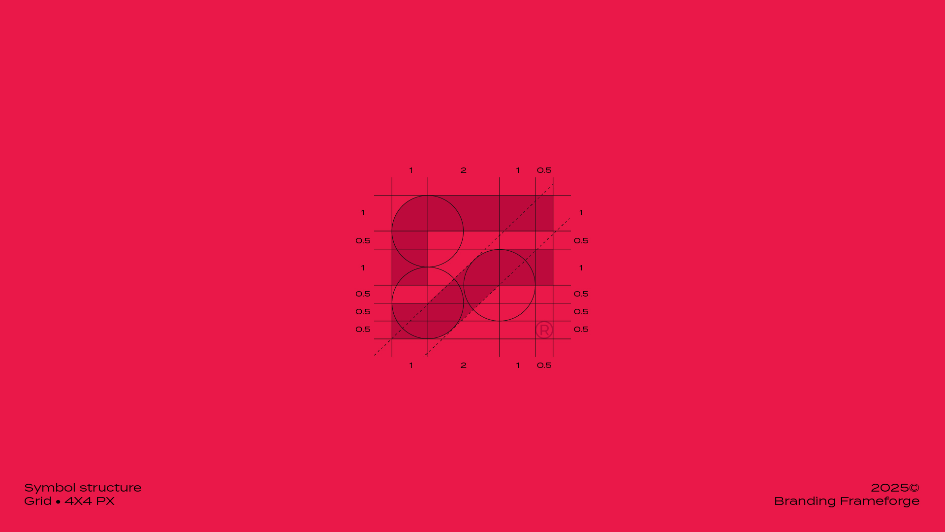
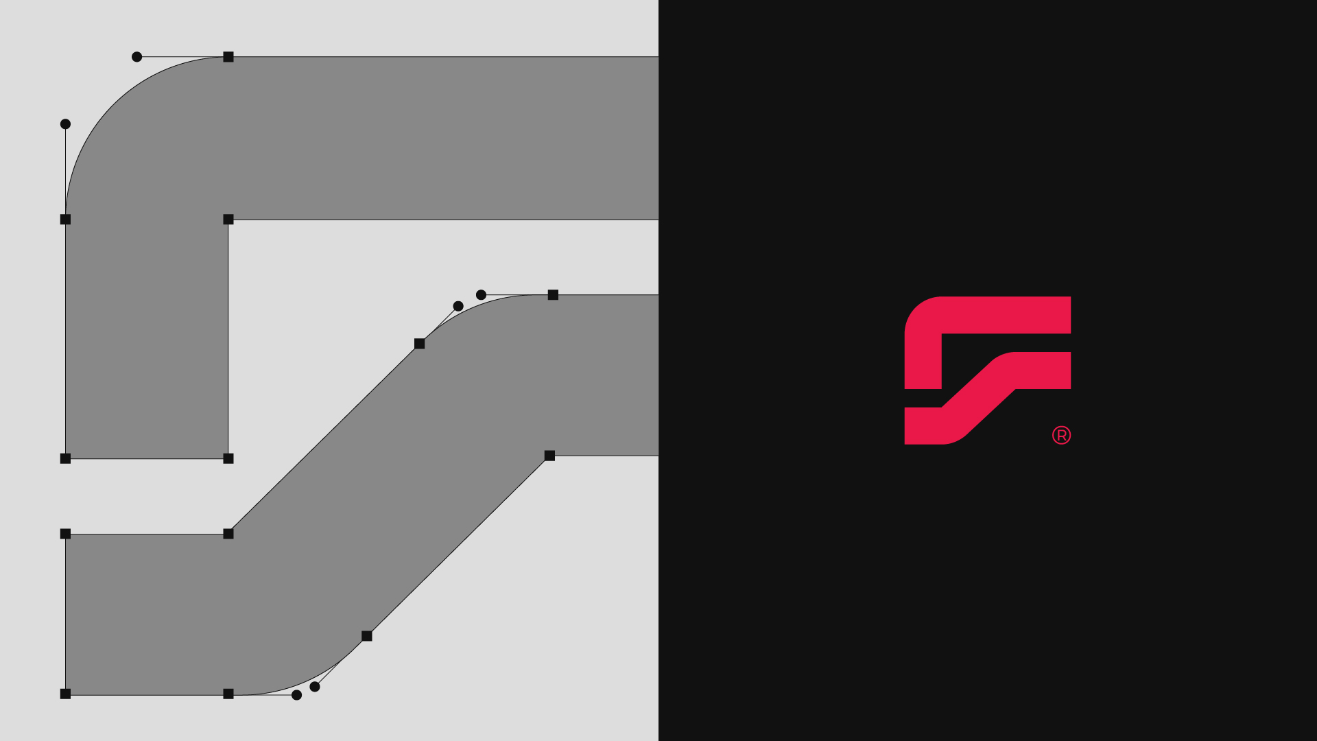
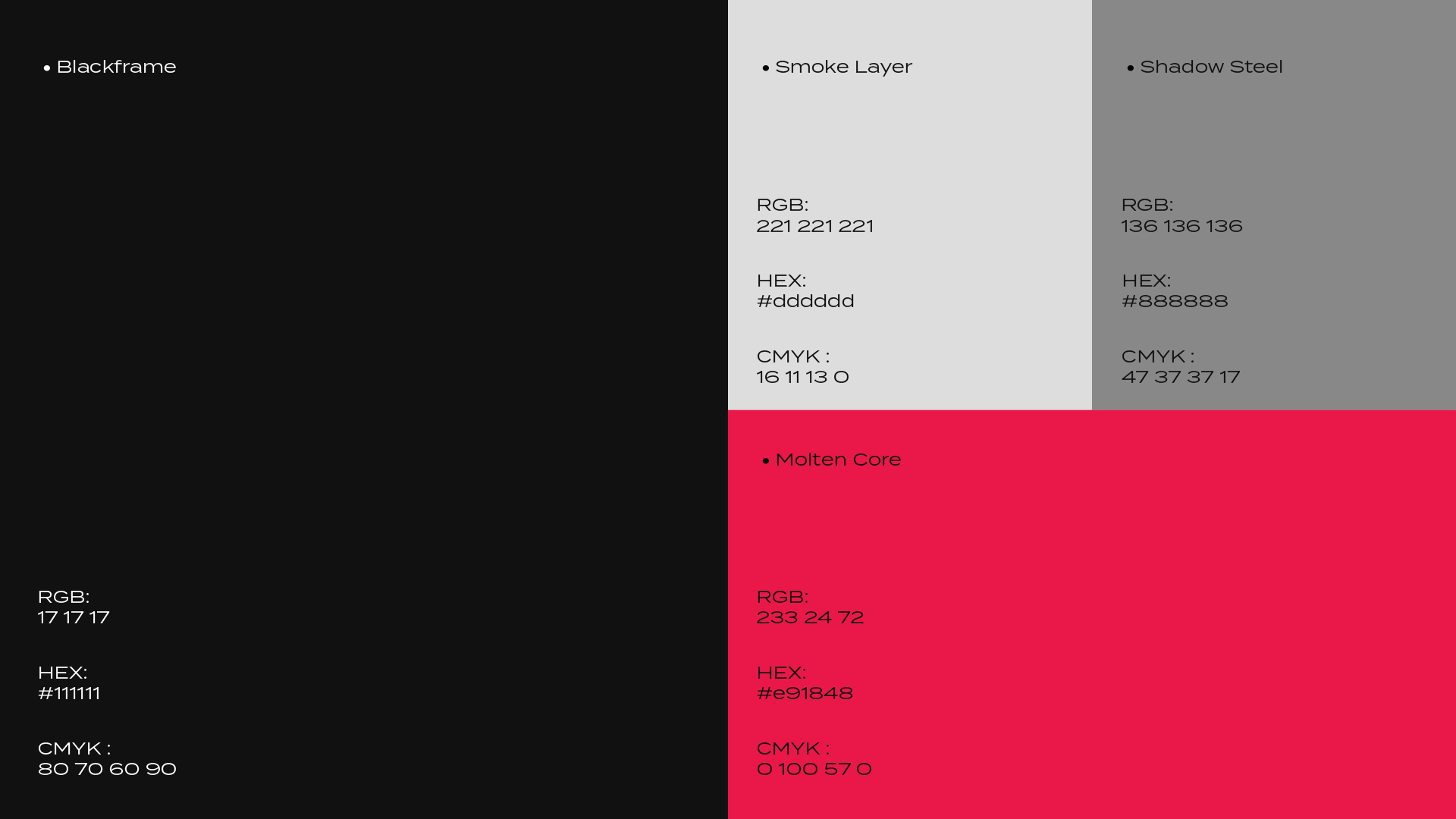
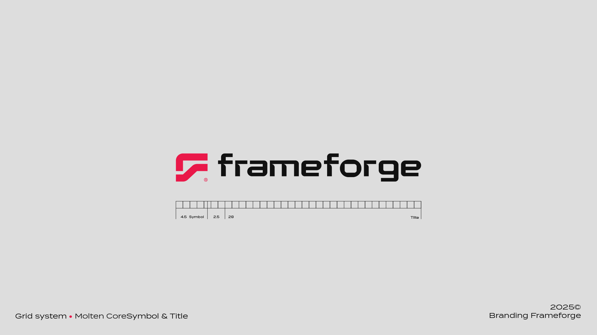
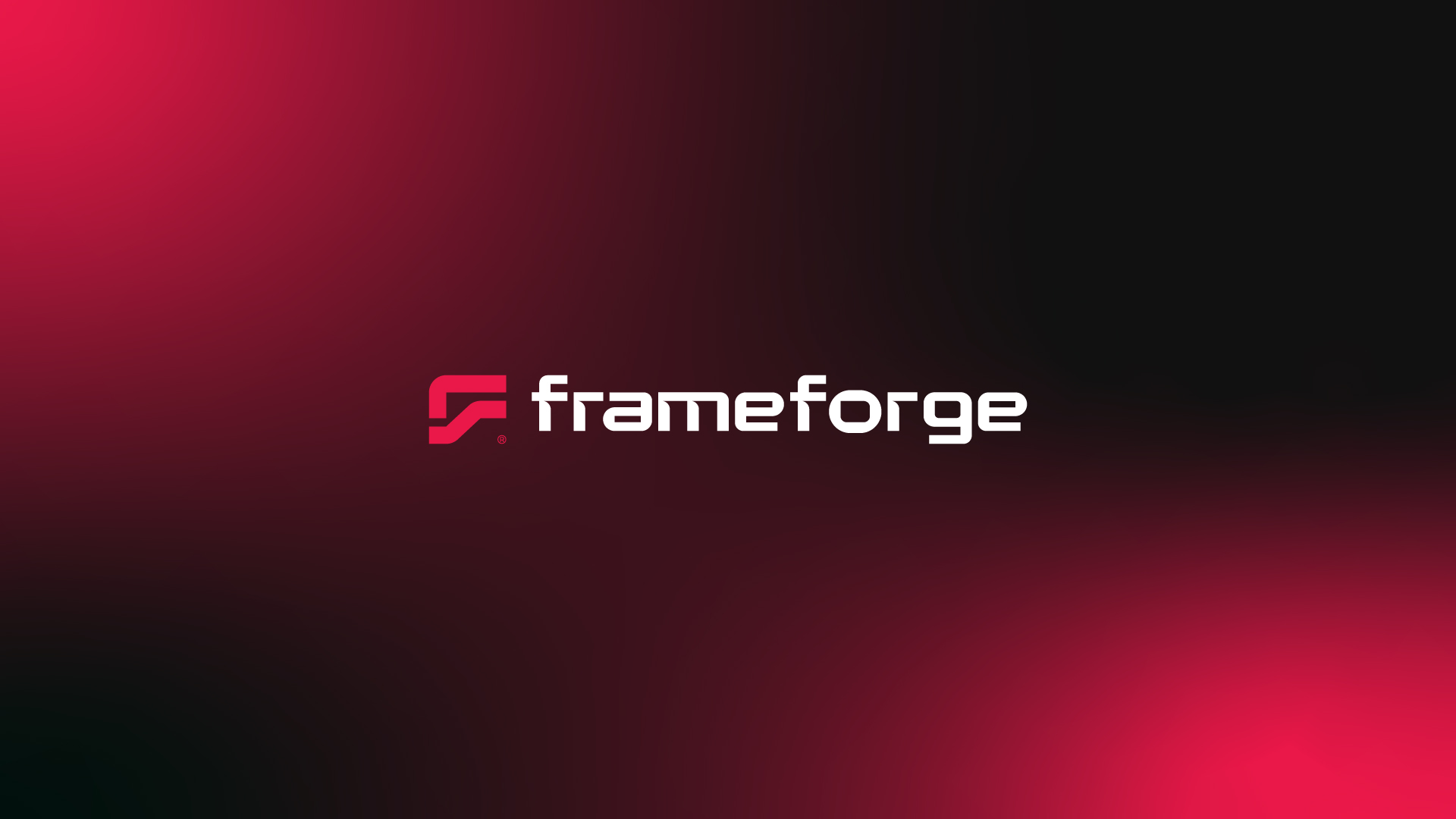
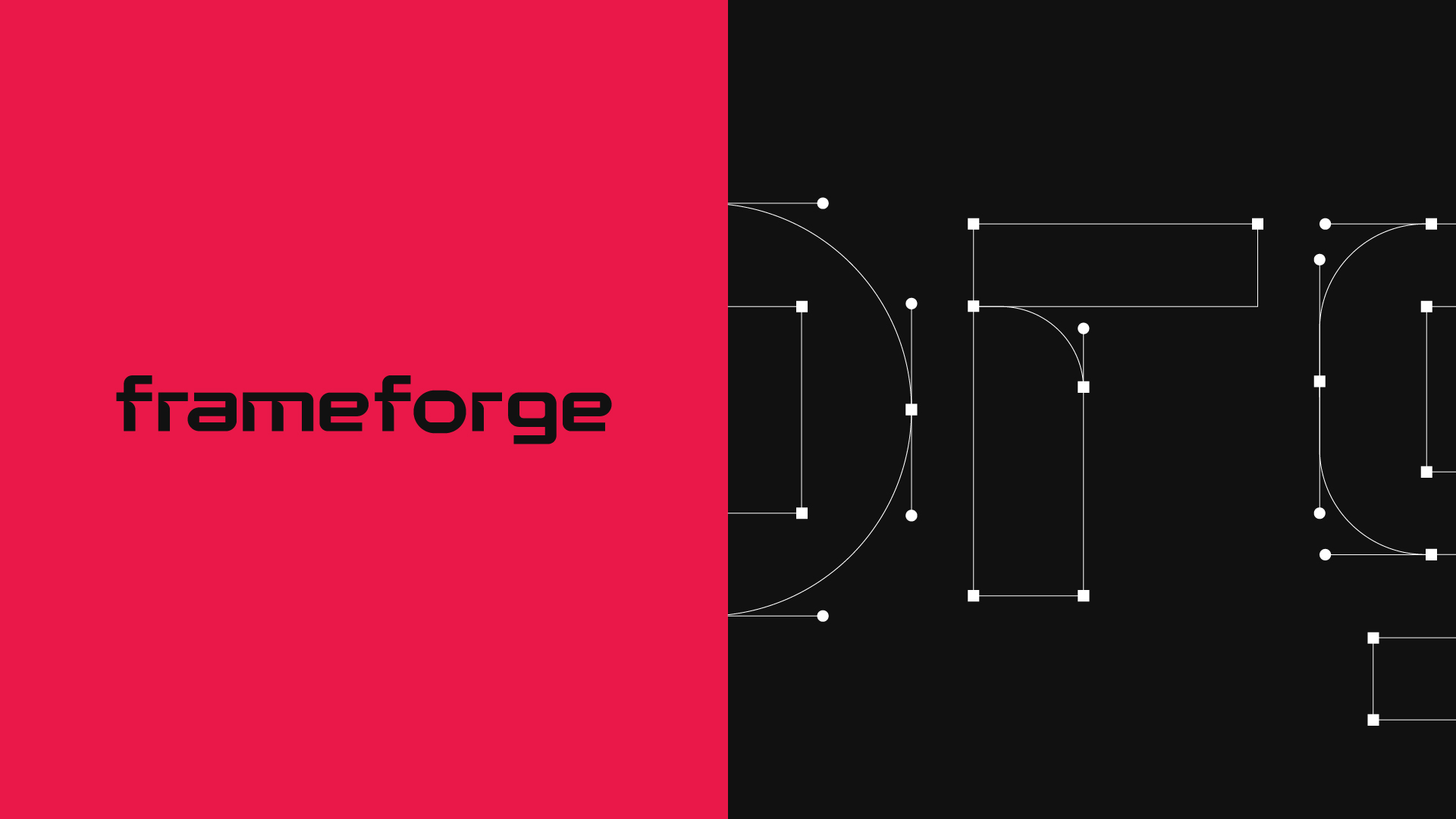
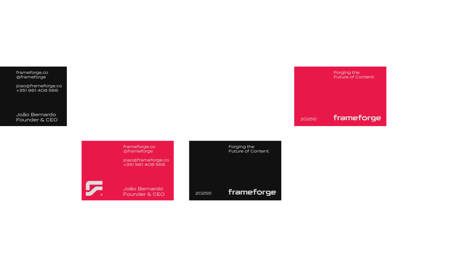
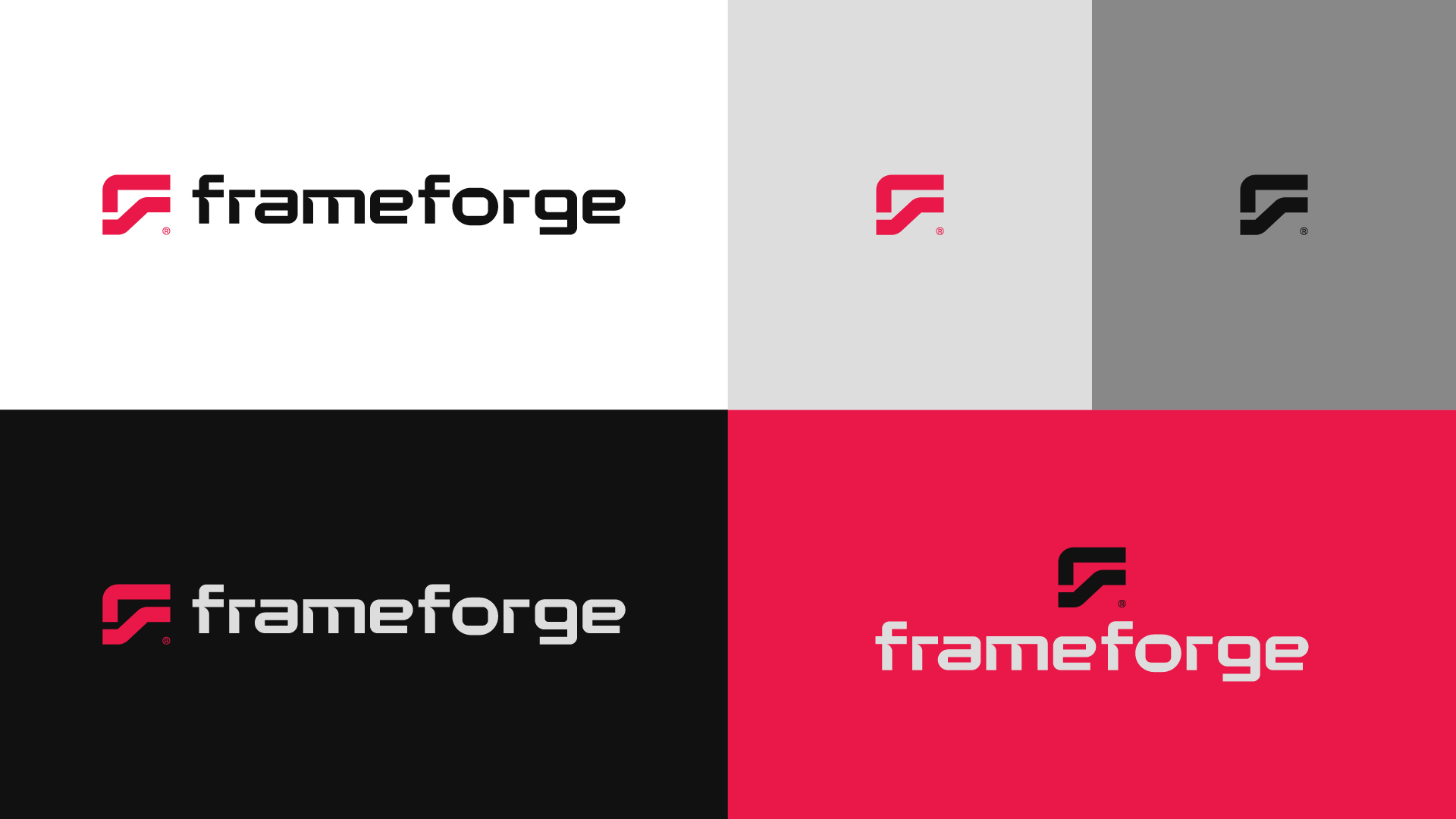
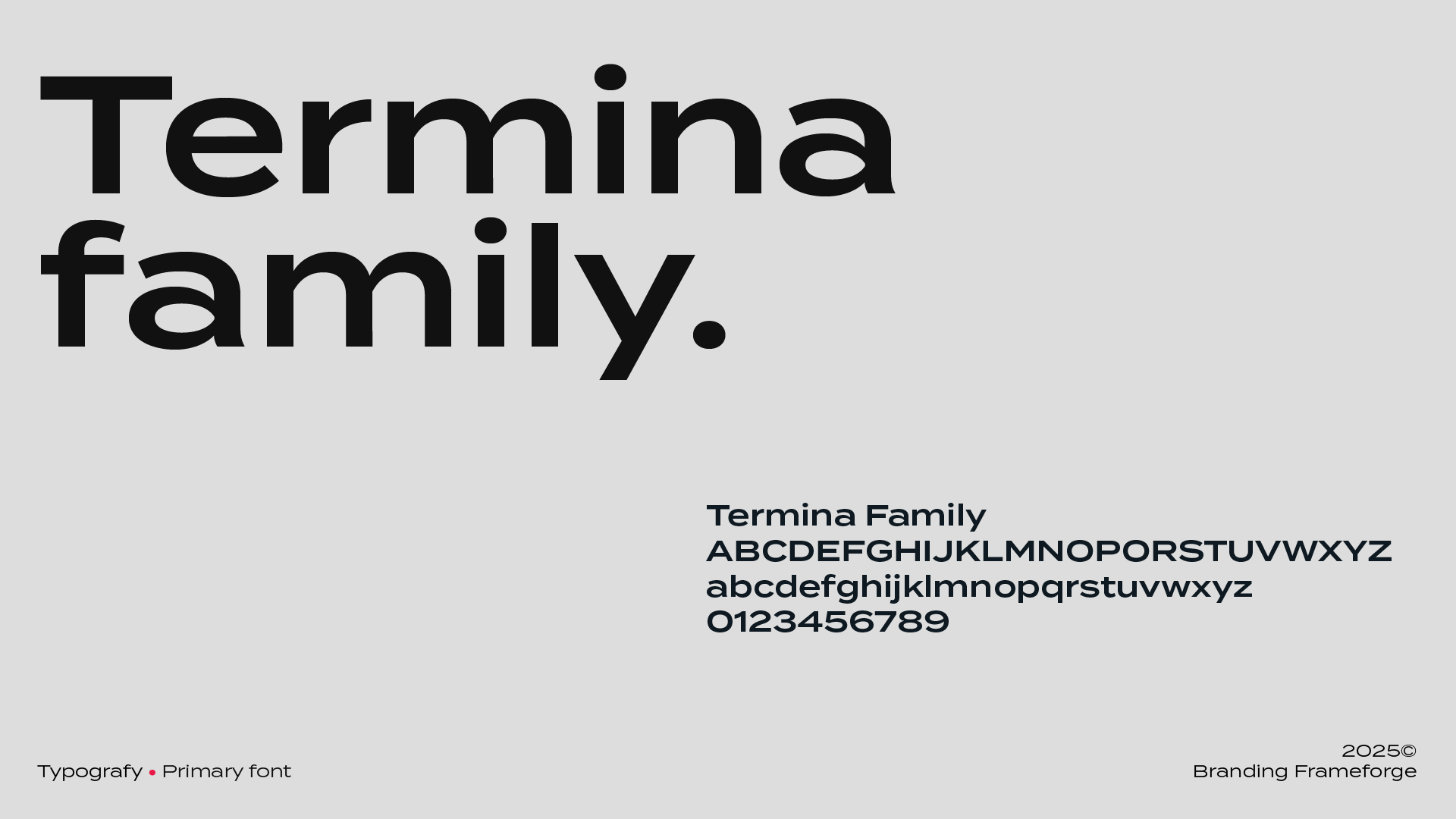
The logo is created from two overlapping “F” letters, forming a geometric symbol that recalls the gesture of framing a shot and a speech bubble, suggesting dialogue and idea exchange. The palette combines vibrant orange — energy and transformation — with black, white, and grey, delivering structure and elegance. Light and shadow gradients evoke focus and a creative environment, while the Termina typeface ensures a bold, modern visual presence.