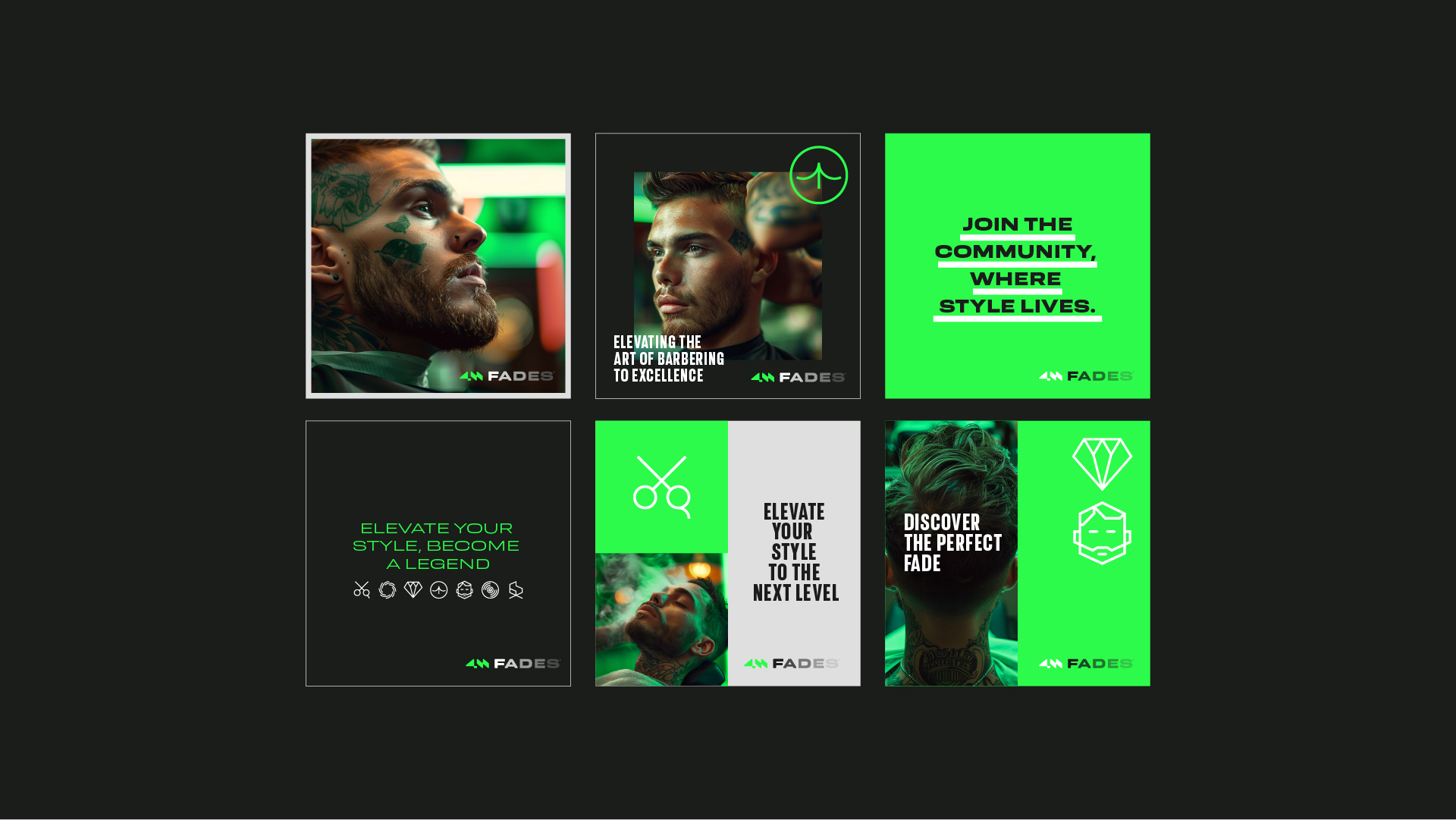
4M Fades is more than just a barbershop—it’s a concept that blends precision, style, and identity. From branding development to the definition of its visual language, every detail has been carefully crafted to reflect the sophistication and modernity of the barbering world.
The brand’s design conveys strength and authenticity, combining strategic graphic elements with an urban and contemporary aesthetic. With a striking visual identity, 4M Fades positions itself as a benchmark of excellence in the industry, seamlessly merging tradition and innovation.
PROJECT
Branding, Digital Marketing, and Video Production
CLIENT
4M Fades
DATE
Mar 2024
ART DIRECTOR
Stephen Philipe Bellotto
DIGITAL STRATEGIST
Patrícia Rambo Bellotto
VIDEO DIRECTOR
Giovani Silva
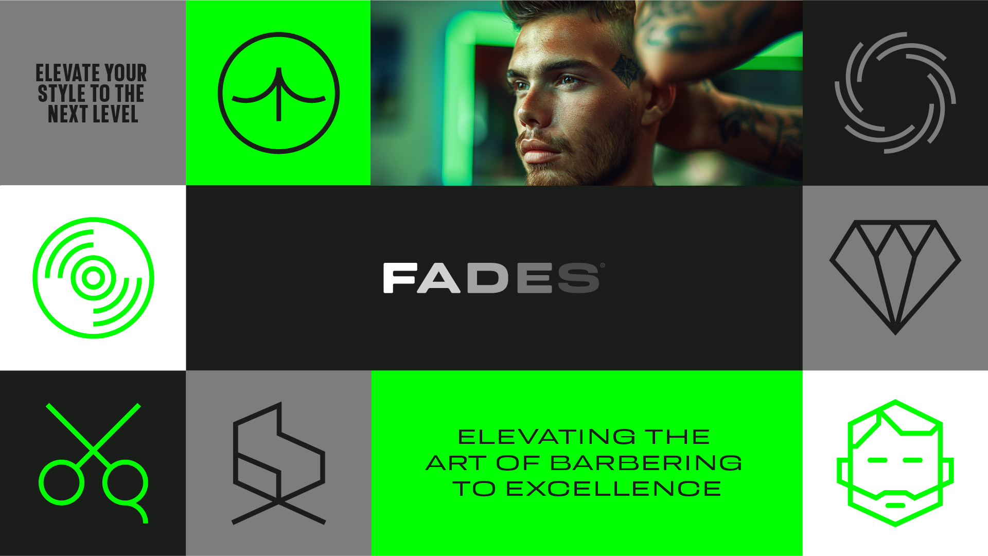
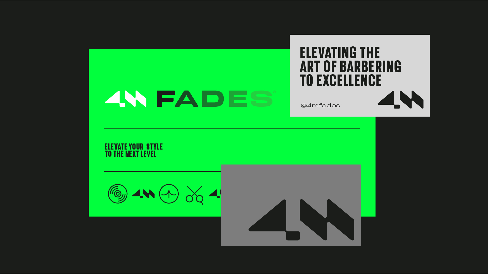
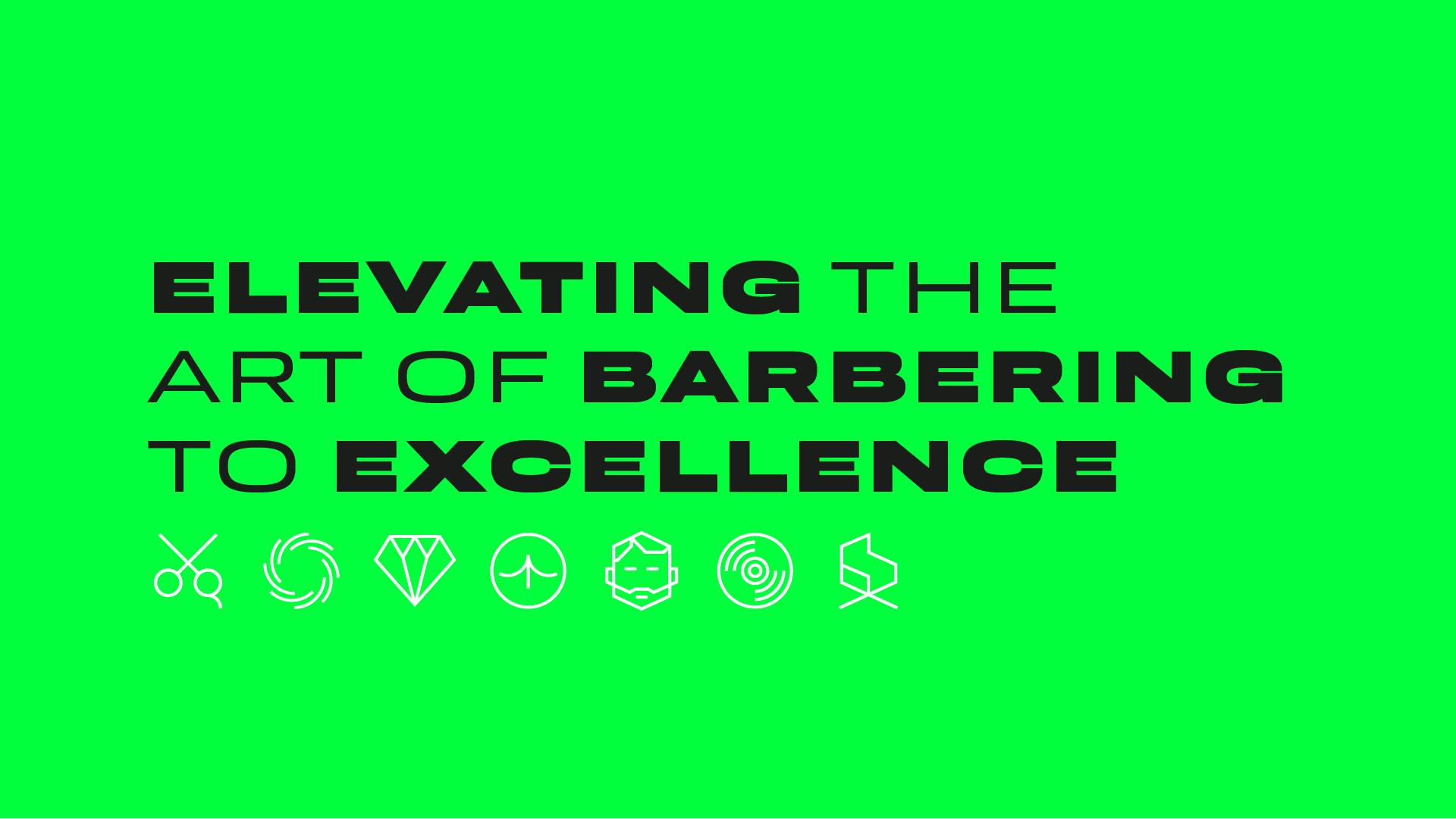
ELEVATING THE ART OF BARBERING TO EXCELLENCE
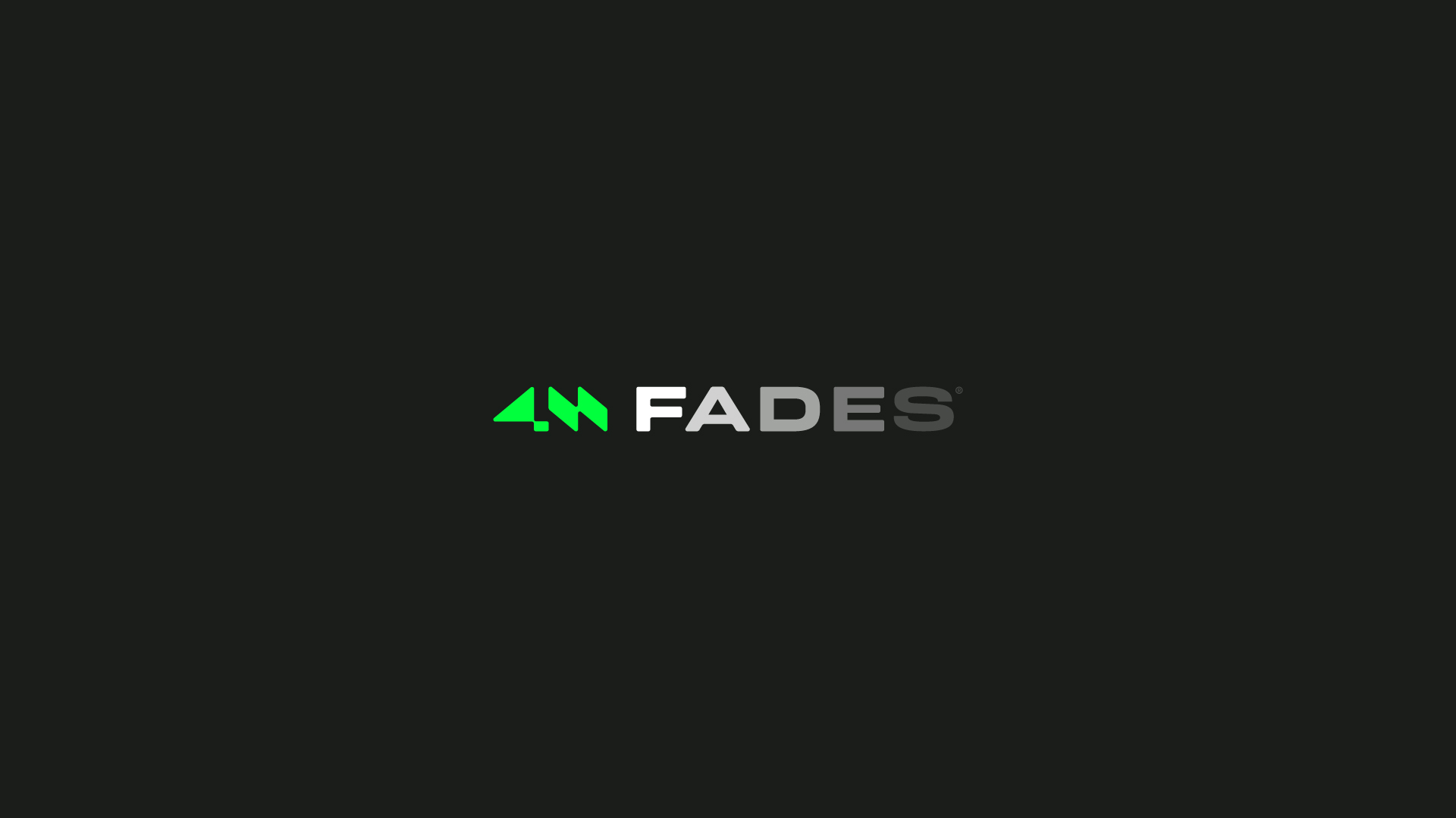
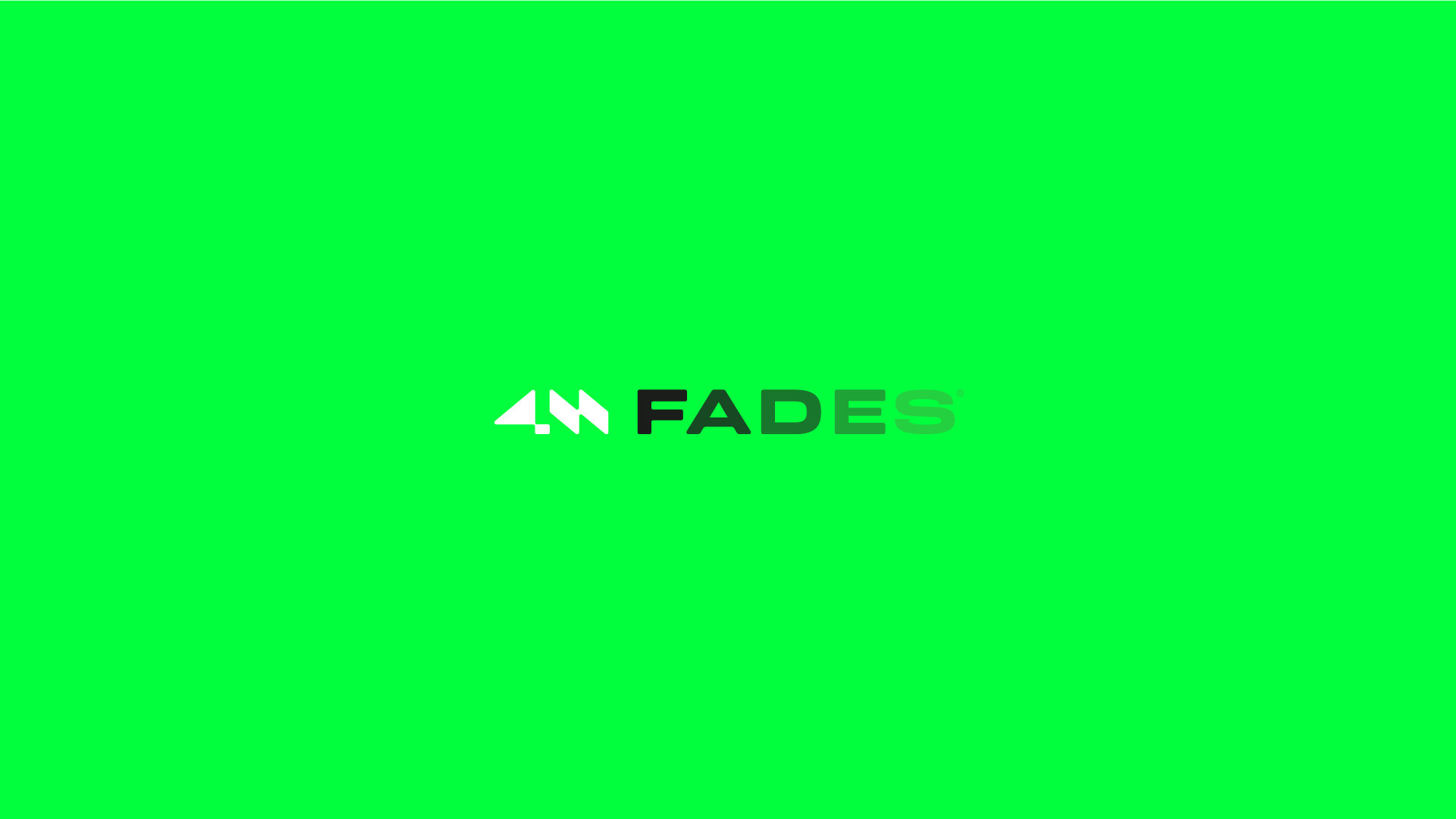
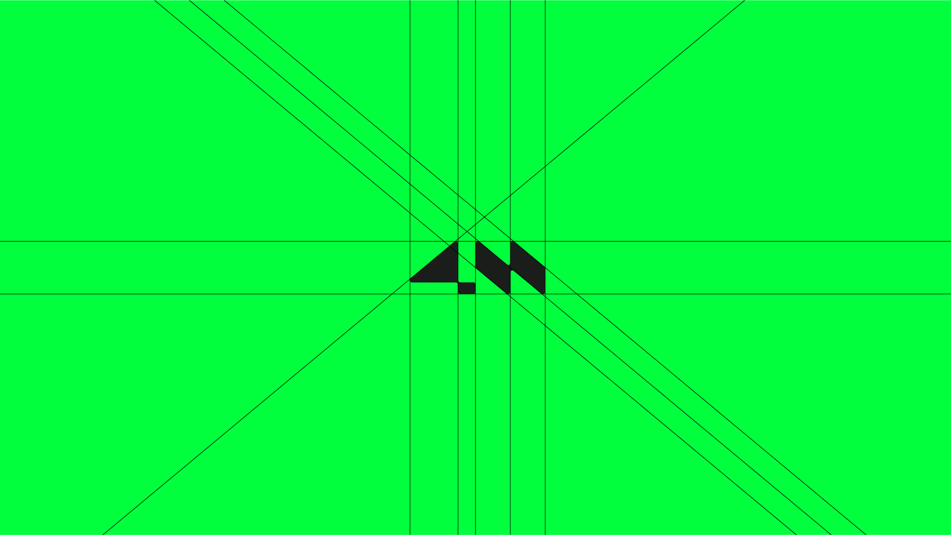
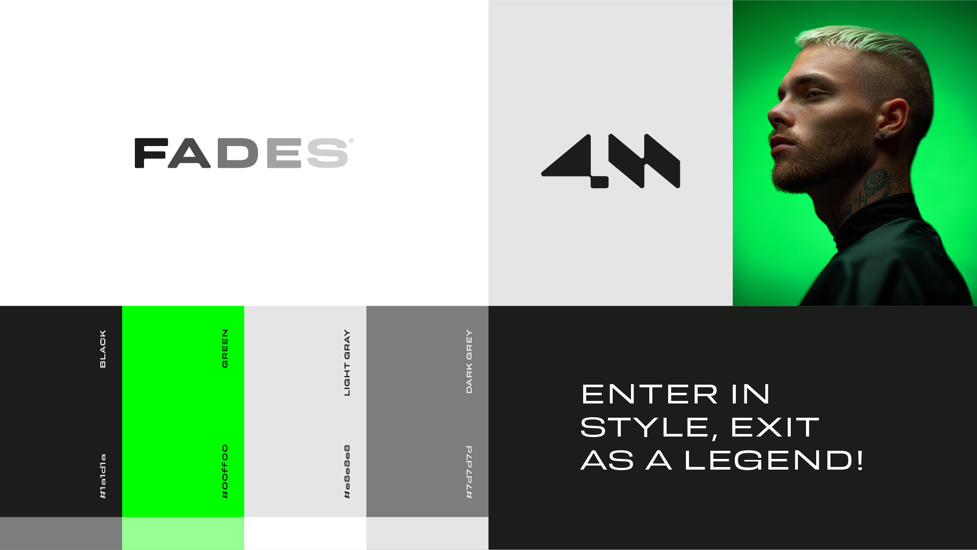
The logo emerges as a visual masterpiece, where distinctive elements masterfully intertwine to forge an iconic and meaningful representation of the brand. At the heart of the design lies the inspired fusion of ‘4’ and ‘M’, precisely sculpted into minimalist geometric shapes and bold diagonal cuts. This choice not only gives the logo a refined and contemporary aesthetic but also establishes a deep sensory connection with the art of barbering, reflecting the precision and boundless creativity of this craft. Moreover, the integration of the word “FADE” next to the symbol, with each letter’s opacity smoothly diminishing, not only highlights the brand’s name but also enhances the notion of transition and smoothness, perfectly reflecting the “fade” haircut style the brand executes with excellence. This approach adds an additional conceptual layer to the logo, injecting originality and making it memorable. The color palette – vibrant neon green, sober black, and elegant shades of gray – carries a deep meaning, invoking a sense of modernity, sophistication, and the vibrant dynamics of trap culture.
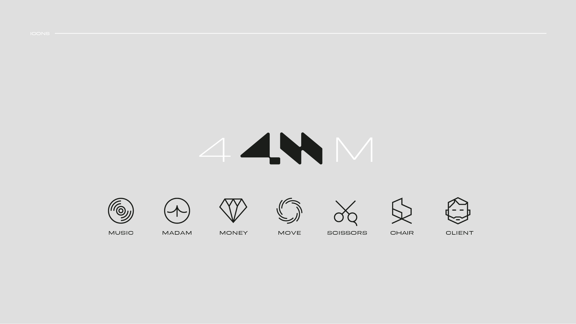
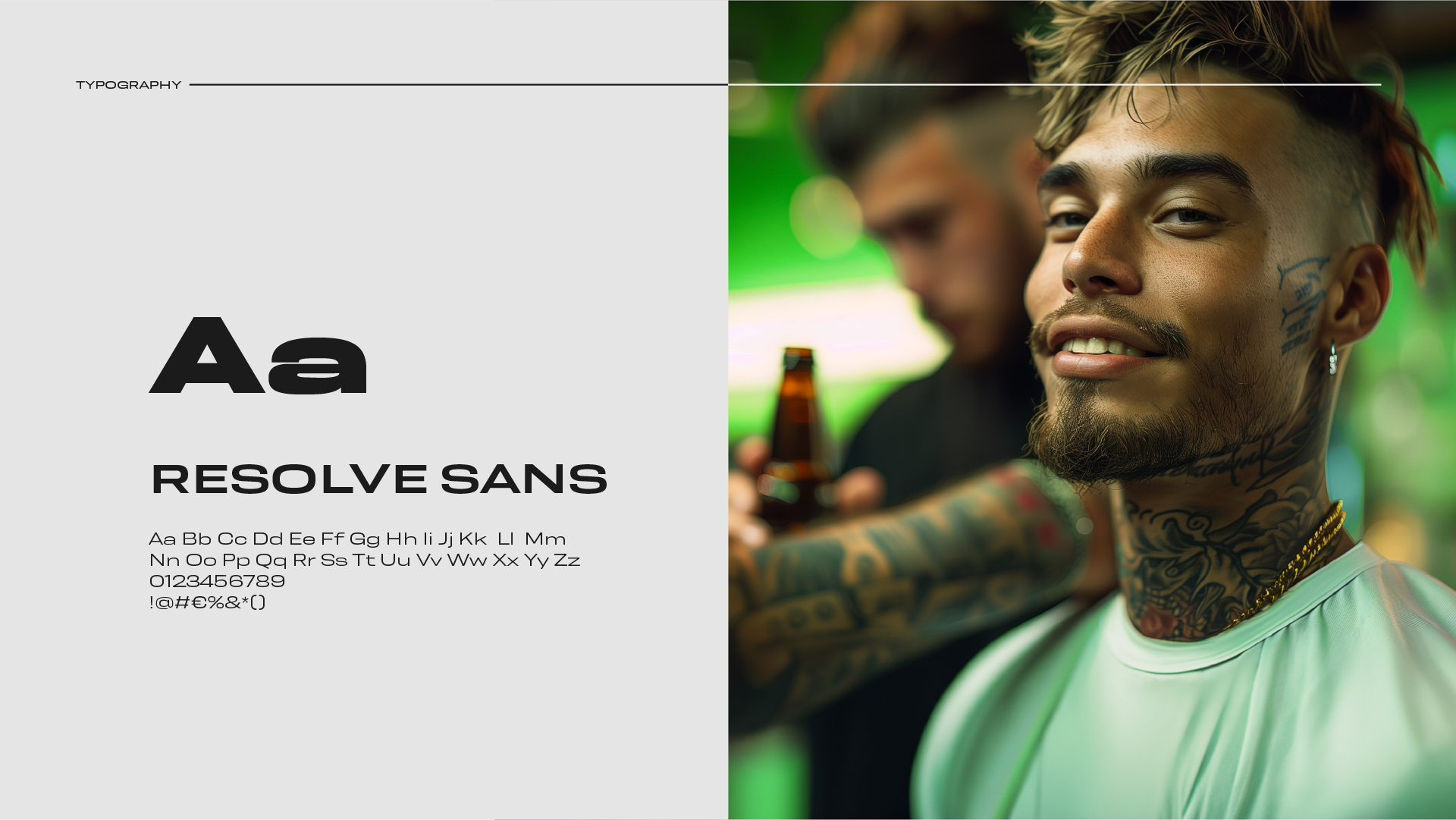
To further enrich the design, meticulously created icons encapsulate the intrinsic values associated with the “4M” acronym: madame, movement, money bag, and music. These icons add depth to the visual narrative of the logo, highlighting the brand’s complex and multifaceted identity, as well as its connection to a contemporary and bold lifestyle. The chosen typography, Resolve Sans, with its diversity of weights and slim lines, amplifies the logo’s visual impact, reinforcing its modern stance and dynamism. The fusion of these elements unfolds a cohesive and captivating visual identity, which not only conveys the brand’s core values but also stands out remarkably in the contemporary fashion and lifestyle scene.